Avoid mobile customer loss, invest in a responsive website.
Smartphones and tablets continue to gain in popularity, and with mobile technology on the rise comes more Internet searches, website visits, social media activity, online purchases and computer apps. For companies who take full advantage of their tech savvy customers across the board, congratulations. But for organizations who still do not have an optimized responsive website, this can quickly hurt the bottom line along with the potential for loyal and new customers who depend on mobile technology for everyday use.
According to the January 2014 Pew Research Internet Project, 90 percent of American adults have a mobile phone, 58 percent have smartphones, 32 percent own electronic readers (e-readers) and 42 percent own a tablet computer.
Aside from just making calls, mobile devices used to be popular for cameras, texting, and GPS directions. But over the years, users have grown dependent on these devices for up-to-the-minute coverage for everything from news to reference material. And when a user can’t get the information she needs now and another site has the same information without the hassle, her attention will go elsewhere. And for companies who have plenty of competitors, they may lose customers for good.
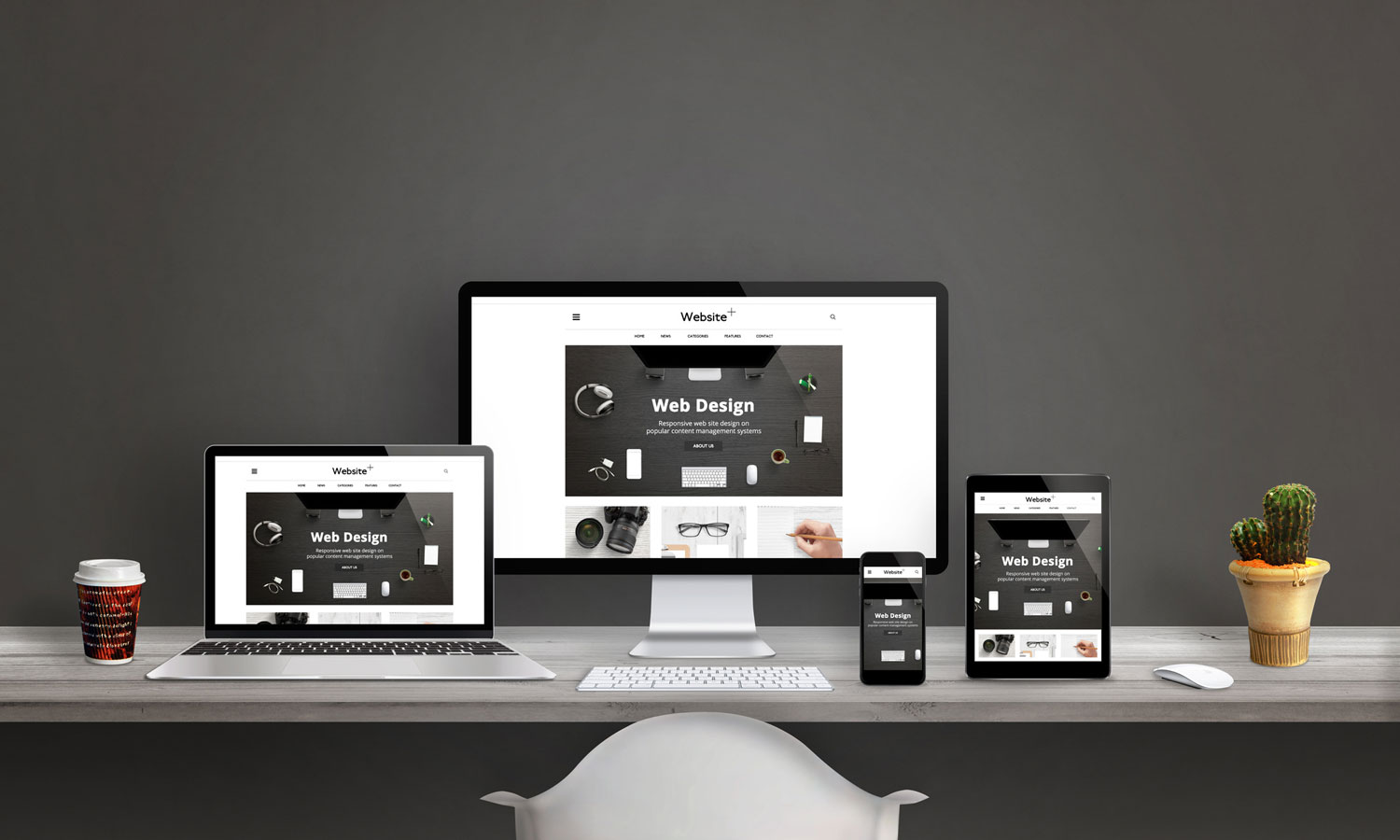
Anyone who has ever used an iPad or a smartphone and had to minimize, maximize, rotate and wrestle with the navigation bars from a site without a responsive website design knows it’s a frustrating experience. Responsive designs are set up by an experienced website designer so that the online formatting adjusts to fit the screen size whether it’s a desktop, laptop, smartphone or smart TV.
Some companies avoid investing in an appropriate responsive website opting for one website for desktop displays and an alternate site for mobile displays. Sometimes this works, but most of the time it’s a fail. A website design that does not focus on the functionality of each device and screen is missing out on the big picture and puts the user experience on the back burner.
A professional website designer and developer can help eliminate this issue by asking the right questions like;
- Depending on what device your site is being displayed on, what is the desired result for each user experience?
- Where and how will the content break and flow in relation to each device/screen?
- What emerging technologies should you be aware of in regards to your responsive website?
These are just some of the questions that should be addressed and resolved before venturing into responsive digital waters. Only then can a site that is user-friendly and accessible be created for technology across the board. As technology spirals and splinters in it’s beautiful exponential growth, experience teaches that for a business to survive it must adapt and be responsive.