Designer Terms, Lingo & Slang For Non-Designers
Working with a designer can be confusing, it’s like we’re speaking another language. You tell them the thingy at the top is “off… it’s wrong it’s just wrong…” and then they throw words and terms at you like Above The Fold, Navigation, Widows and Orphans? Here is a glossary of terms to help bridge the divide from “WTF does that mean” to crispy clear communications without the frustration.
Of course, this guide will be updated from time to time because language like design is constantly evolving.
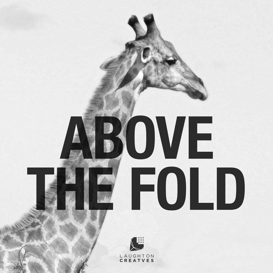
Above The Fold
This is an old-timey phrase from the soon to be extinct newspaper industry, which means place the most important information, the headline, at the top half of on the front of a folded newspaper. In terms of printed media put the most eye-catching and important information upfront and near the top. For website design, it is the content seen on a web page before you start to scroll. Above The Fold gets their attention and your well written, picturesque imagery holds the viewer long enough to embed the message.
Align, Alignment
To position letters, words or images on the same vertical and/or horizontal line.
Aliasing
In computer design, it is an undesirable effect — also known as “jaggies” — in which the edge of the image or letter is characterized by a stair-step appearance. Jaggies are especially noticeable where there is a high contrast between the interior and the exterior of the silhouette.
Art Director
The individual responsible for the selection, execution, production… and so on, of graphic art.
Asymmetrical
This is when text and/or graphics are not identical, not balanced, on both sides of a central line.
BMP
A file format similar to JPEG and PNG but without any compression. It is an image format left over from the throwback years of early computer graphics, so it’s rarely if eve used today.
Baseline
The imaginary horizontal line on which a line of letters (type) rest.
Bitmap
The group of individual pixels that make up an image for a screen or individual image. (See Bitmap file format)
Bleed
A printing term that refers to printing beyond the edge of the document (business card, brochure, etc)and is later trimmed so that the image “bleeds” off the edge of the sheet. The purpose is to ensure there is no chance for white lines on or near the edges.
Block Quote
A brief quotation – four or more lines – within body text, that is set apart in order to clearly distinguish the author’s words from the words the author is quoting.
Body type/text
The typeface used for long passages. Used in the main text of a document, book, brochure, etc. such paragraphs.
Brand
A brand is a mixture of attributes, tangible and intangible and communicates specific information about an organization, product or service. A brand carries a “promise” about the qualities and characteristics that make the organization, product or service unique.
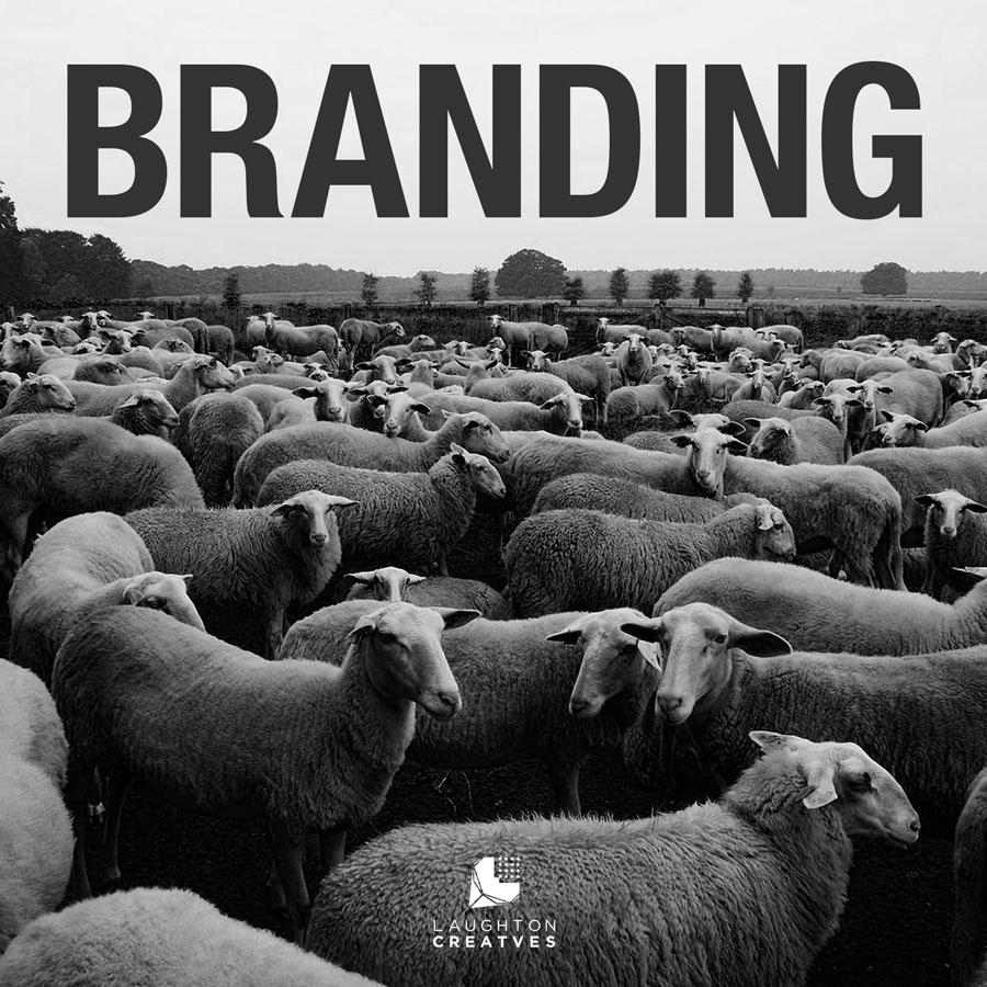
Branding
The process involved in creating a unique name, image, sound and/or smell (yes you read smell), for a product in the consumers‘ mind, mainly through advertising campaigns with a consistent theme. Basically to distinguish a product or businesses uniqueness in the marketplace. The term “brand” comes from using a hot “branding iron” to separate one person’s cattle from another. For you, branding separate you from the herd.
Caption
An identification (title or description) for an illustration/image, usually a brief phrase. The caption should also support the other content.
Clip Art
Ready-made, simple pictures, artwork, and symbols sold or distributed. They were meant for copying and pasting into publications such as MS Word documents.
CMYK
Abbreviation for Cyan, Magenta, Yellow, and Key (black). In four-colour printing the cyan, magenta, and yellow printing plates are aligned or keyed to the black plate.
CMS
Abbreviation for Content Management System. A CMS is software that is used to create and manage digital content. WordPress is the most popular website development CMS which allows users to create and manage website content with relative.
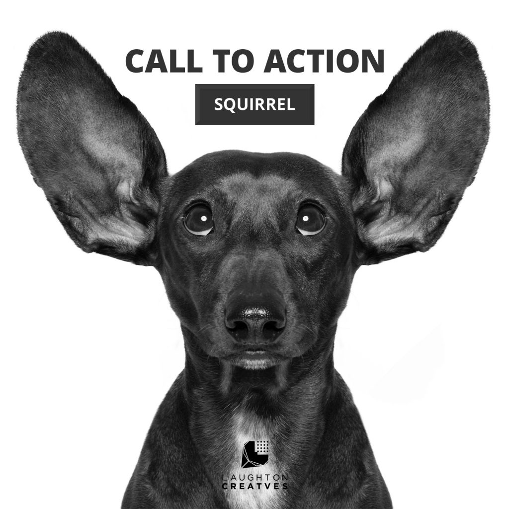
CTA (Call to Action)
A Call to Action is just what it sounds like; a very visible element asking users to finish an action. Common CTAs may request that users subscribe to a newsletter, purchase a product, set up an appointment or download specific educational materials, just to name a few .
Copy
In publishing and graphic design, “copy” refers to the text in/on materials such as books, magazines, newspapers or a website.
Copyfitting
Copyfitting means fitting a specific amount of text into a set space. Things that can affect copyfitting are kerning, leading, the kind of font and the size of each font. Designers often use “Lorem Ipsum” or placeholder text to give you both an idea what the final layout will look like.
Corporate Identity
A component of an overall brand identity including the brand’s core component — primarily its name and logo. A corporate identity system typically includes formal business stationary, not relating to marketing — e.g., business cards, letterhead, envelopes, mailing labels, invoices, etc. (Compare to “Brand Identity or Branding.”)
Crop Marks
This relates to printing, it is horizontal and vertical lines that indicate the edge of the printed piece.
Cropping
For artwork, cutting out the non-essential parts of an image, usually a photograph.
DPI
This stands for Dots Per Inch which is the unit of measure of a printers/print quality. For the best printing quality, 300dpi is always recommended.
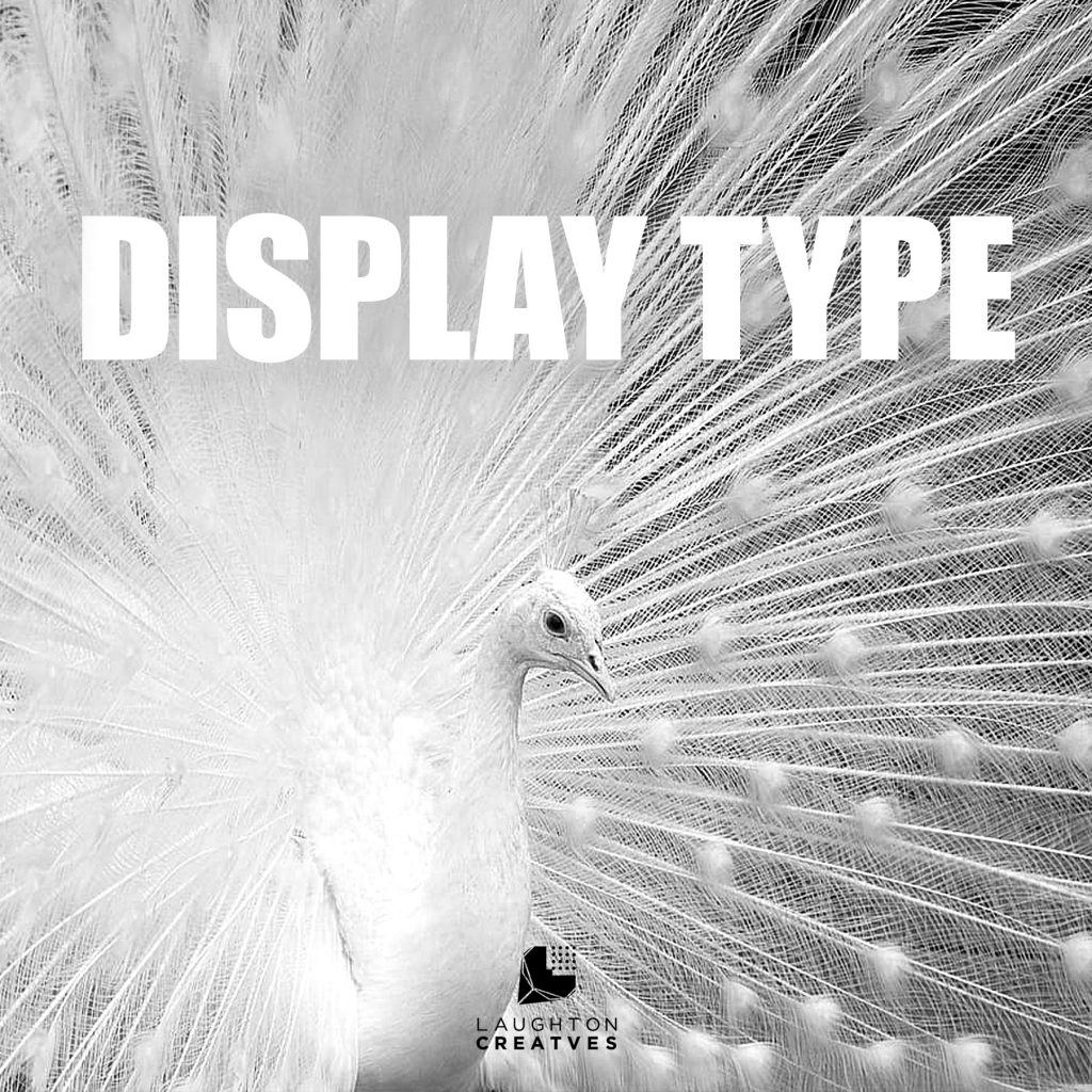
Display Type
In typography, it is usually a decorative type set in larger point size than the body text and is often used in headlines. Think of film titles for posters, article titles in newspapers, magazines headlines, etc.
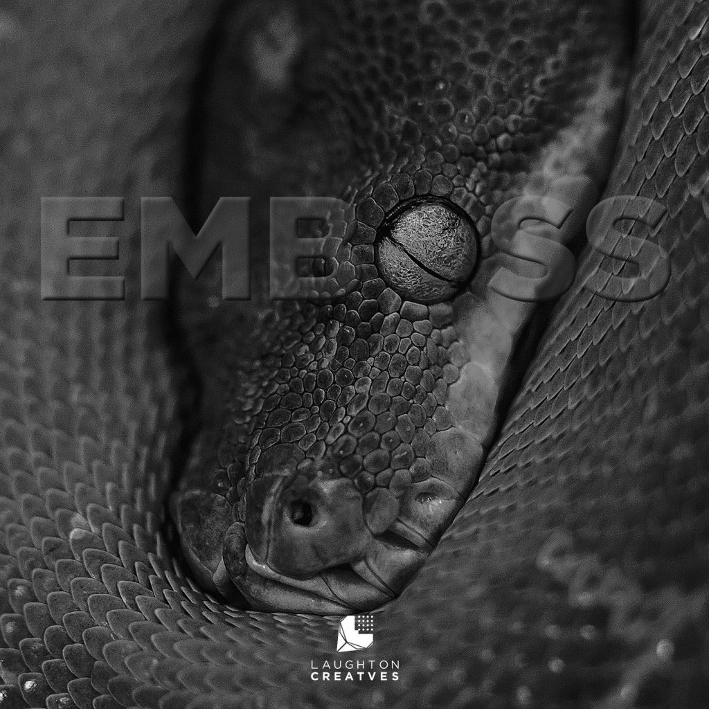
Emboss / Deboss
To give an image dimension by projecting (embossing) or pressing (debossing) the image from a flat surface by using design software or printing.
Extrude
Pretty much the same as embossing but often it’s more dramatic.
Facing Pages
In a double-sided document, such as a book, they are the two pages that are viewed as a spread when the publication is opened.
Focal Point
The focal point is where you want to direct the viewer’s eye or attention.
Font
A set of characters in a specific typeface.
Footer
The bottom section of a web page is also known as a footer. This area typically contains redundant but important information such as basic navigation links. But more often than not you’ll see additional links to “Terms of Use,” “Privacy Guidelines,” and copyright information.
Four-Color Process
The printing process that reproduces colours by combining, CMYK (cyan, magenta, yellow and black). Viewed through a magnifying glass, the printed image consists of dots in these four colours.
Gamut
Refers to the range of colors available to a particular output device or a given color space, such as a computer monitor. If the color range is too wide for that specific device, it is indicated as ‘out of gamut’.
GIF
A compressed image format that supports, background transparency, animated and static images. One of the most widely used graphic image file formats on the web. Use full for short-run memes and limited to only 256 colors.
Graphic Design
A broad term applying to a number of artistic and professional disciplines, which focus on visual communication and presentation. Various methods are used to create and combine symbols, images and/or words to create a visual representation of ideas and messages. Various methods are used to create and combine symbols, images and/or words to create a visual representation of ideas and messages.
Header
This is a line or lines of copy, set in a larger face than the body copy. Pertaining to website design it usually refers area at the top of a website which contains the company’s or organization’s logo and the main navigation bar.
Hero Graphic
A hero graphic can be described as that big picture in the middle of everything. It is the main image of your website, email or printed matter. Your graphic designer will likely spend more time getting this image right than any other you work with because it plays such a strong role in conveying the mood and message you are trying to create.
High-Resolution
For the best results, sharp reproductions in publications, it is recommended that your images be 300 dpi. As for website design, the best resolution is 72 dpi. With the fast progression of technology and screen resolutions, such as retina and high-definition displays, it’s always recommended to have the largest image size possible so your graphic designer can then reduce the image to an appropriate size.
Icon
An image that represents an object or action or marker for entry into information. Usually interactive.
Italic
The style of type that usually slanting to the right. Used to emphasize text.
Jaggies
An alternate term for the results of aliasing. See Aliasing. Also known as stairsteps.
JPEG
Abbreviation for Joint Photographic Electronic Group. A common image format process for compressing digital images.
Kern
To squeeze together characters, for a better fit of strokes and white space. In display type, characters almost need to be kerned because the white space between characters at large sizes is more noticeable.
Landscape
A page or image orientation or layout that is wider than it is tall.
Layers
A tool within a graphic software, such as Adobe Illustrator and Photoshop, that permits the user to gather, organize, and re-edit their artwork.
Leading
Pronounced “led-ding”, it refers to the amount of vertical spacing between lines of type. In website design, it is called “Line Height”.
Ligature
In typography, two or more characters designed as a single character. Examples are ae, ce, th, etc.
Line Height
See Leading
Logo
A logo is an image who’s purpose is to represent the identity and core values of an organization. A logo is an integral part of an overall brand and promotes instant public recognition and reinforces the unique features and characteristics of the organization.
Logotype
A logo, symbol, mark or identifying name designed using typography. Example, Ford, Disney, Google, etc.
Low-Resolution
An image – either on a computer display or in printed form – that has a low number of dots-per-inch or pixels-per-square-inch.
Margin
The unprinted space on a page, primarily the area around a block of text or image. Margins are used to aid in the aesthetics, the readability of a page, and also to provide allowances for trimming, binding, and other post-press operations.
Monochromatic
Displaying a single colour, usually presented with shades and tints of that single colour.
Monogram
A type of logo using the first letter(s) from a name to create a sort of visual shorthand or abbreviation. Examples: VW, the double C for Chanel and the iconic NY for New York Yankees.
Navigation
Sometimes called the menu, it is the place on each webpage where the main links to other webpages on your website are displayed.
Negative Space
In design, the area where the figure is not. In art, sometimes the background. In publications, the elements of the page not occupied by text or images. additionally referred to as “White Space”.
Noise
Noise is a term used to describe the formation of pixels that contain random colors.
Offset Printing
A printing technique usually used for larger run reproduction where the inked area is transferred (or “offset”) from a plate to a rubber blanket, then to the printing surface.
Orphan and Widows
In typesetting, orphans and widows are very short lines at the beginning or end of a paragraph, which are left hanging at the top or bottom of a column. An orphan and widow are considered bad typography because it creates too much white space between paragraphs or at the bottom of a page. This disturbs the reader’s eye and reduces readability.
PMS
Pantone Matching System. A standard colour-matching method used by graphic designers and printers to match inks, papers, and other materials. A PMS colour is a standard colour defined by percentage mixtures of different primary inks.
Palette
The collection of colors, tints or shades available or used in a project, graphic system, or program.
Pixel
In digital imaging, it is a term for an element or the smallest point or dot on a computer monitor which makes up digital images.
Pixelation
To understand pixelation, remember some of the first video games, such as Atari’s Pong. Remember how the graphics were made up of tiny chunky blocks? Each of these squares are called pixels. When we look at today’s video games, high definition monitors, and tv screens where the pixels are barely noticeable. The reason is that the pixels are much smaller and tightly packed. This results in a more detailed, realistic, viewing image. (Also see “raster, raster images”)
PNG
Portable Network Graphics format, usually pronounced “ping”, is used for lossless compression and offered background transparency. The PNG format displays images without jagged edges while keeping file sizes rather small, making them popular on the web. PNG files are generally larger than GIF files.
Portrait
A page format who’s page height is greater than it’s width. See also Landscape.
PPI
An abbreviation for Pixels Per Inch or “pixel density”. A measurement of the pixel density, resolution, of an electronic display.
Print Procurement
The term is used to describe the process used to manage printing and print-related costs between the printer and its’ end user, the client. Large organizations spend a significant amount of money and personnel arranging large print jobs, or the provision of printing services within the company. The objective of print procurement is to manage costs and services through the application of a series of strategic procurement concepts.
Proof
Any early print of the final printed material produced as a means of checking for typos or other similar errors, as well as positional errors, layout problems, and color aspects. When dealing with a website, designers might call this a wireframe or mockup instead.
RGB
RGB (Red, Green, Blue) is the model used to project color on a computer monitor. By mixing these three colors, a large percentage of the visible color spectrum can be represented.
Raster Graphics
Alternate term for bitmapped images. See Bitmap.
Rebrand
When an organization revisits their brand with the intent of renewing or revising based on internal or external circumstances. Rebranding is often necessary if the brand has outgrown its marketplace or its vision has changed.
Register
The degree to which successively printed colors (text or images) are accurately aligned with respect to each other.
Resolution
Also, know as screen resolution or display resolution. The number of horizontal and vertical pixels displayed on a screen. The more pixels, the more information is visible without scrolling. Screen resolutions have a pixel count such as 1920×1080, which means 1,920 horizontal pixels and 1,080 vertical pixels.
Responsive Design
(Responsive Web Design) Simply it’s when a website is designed to look good on different devices. The site should be easy to use, minimal scrolling, and viewable regardless if the user is viewing on a “television”, desktop, tablet or phone. Elements on your site will fit the screen using CSS (Cascading Style Sheets) and HTML to resize, hide, reduce, expand, or shift the content to make it look good on any screen.
Royalty-Free
Intellectual property that is sold for a single standard fee. These can be used repeatedly by the purchaser only, but the company that sold the intellectual property usually still owns all the rights to it. Royalty-free intellectual property can be photography, digital illustrations, video, audio files and computer codes to name just as technology rapidly progress.
Sans Serif Typeface
A typeface that has no serifs, such as Helvetica or Swiss. See serif.
Saturation
The level of intensity of a colour is determined by a combination of light strength and how much it is distributed across the spectrum of different wavelengths.
Serif
In typography, it is a small line projecting from the ends of a stroke in a letter or symbol.
Sidebar
In reference to graphic design and website development, it is the text and/or graphics set off from the primary elements to add additional or peripheral information. Sidebars may also be type set using a different font than the main text.
Soft Copy
Often the first part of the proofing stage, a soft copy is any page, document, publication, or other data that exists on a computer display, rather than as a printout, or hard copy.
Spot Colour
Aside from the four primary spot colours used in the offset-printing process, “spot colour” often times refers to any colour generated by non-standard, CYMK, offset ink; such as fluorescent, metallic, or custom hand -mixed inks. The Pantone Matching System (PMS) is the most widely recognized system for spot colors.
Swipe File
Sometimes called a “mood board”, a swipe file, or a tear sheet, it is a collection of things that give you and/or designer a sense of the aesthetic you’re going for and is a great way inspire you and to get the conversation started. It can consist of magazine clippings, digital images, text and colour palettes.
Tabloid
An 11″ x 17” page, most often used in portrait orientation for newspapers. Not to be confused with an 11″ x 17″ spread, which is made up of two 8.5” x 11″ pages.
Template
In page layouts or website designs a design template is a pre-designed package, a structured blueprint of sorts, to make it easier for users to add their own images and/or text which will make it their own. Using architecture as an analogy templates are like pre-built homes. You can take them as is with your own furnishings or you can do light or heavy renovations to your heart’s content. But once you get into structural changes, sometimes it’s best to start from scratch and get a custom design.
Text Wrap
A term used in page layout software which allows blocks of text to surround embedded images and sometimes other text.
Thumbnails
A term used by graphic designers and photographers wherein a small or tiny version of an image is a representation of a larger image, meant to make it easier and faster to look at or manage a group of larger images.
TIFF (TIF)
Abbreviation for Tagged Image File Format. One of the most common graphic image formats used in desktop publishing programs such as Photoshop.
Tracking
In typography, to reduce space evenly between all characters in a line. As opposed to kerning.
Typeface
A design for a set of characters which includes uppercase and lowercase alphabetical characters, numbers, punctuation, and special characters. Typeface and font can be used interchangeably to the general public. But as per “Font And A Typeface?” in fastcodesign.com “The difference between a font and a typeface is the same as that between songs and an album.”
Vector graphic
Vector graphics is a graphic format which consists of lines to form images that can scale indefinitely with the ability to stay crisp at any size. This format is great for logos.
Watermark
A translucent design impressed on paper or digital image. Sometimes used as a design feature or to convey a message such as copyright information or the author’s name.
Widow
See orphan
Wordmark
A style of logo design that uses type only. These logos usually involve just color and font and have no attached symbol or icon. Examples: Coca-Cola, Old Navy.
Zip
Abbreviated for Zone Information Protocol. This is a way of compressing files into a smaller size, for storage or transferring files with more ease over the Internet or any other means.