
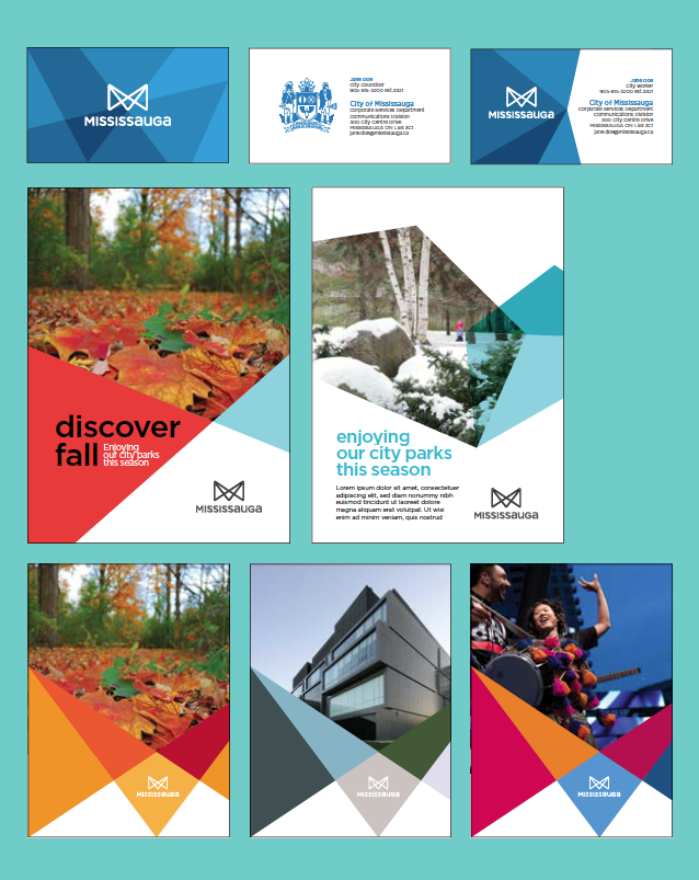
In celebration of its’ 40th Anniversary, Mississauga has re-branded. A brief part of my childhood was spent in Mississauga and comparing then to now is comparing a small quaint town to a semi bustling city. With over half of its population being born outside of Canada the new “M” logo and visual identity is meant to reflect a dynamic, colorful and modern city.
The identity was developed and designed by the city’s in-house Communications Creative Services team and Trajectory lead the initiative as brand consultant. As per they’re brands FAQ the cost for developing the brand story and designing the logo was $170,000. Yeah, that’s how much it costs to brand Canada’s sixth largest city. The breakdown of the cost went into a detailed brand audit, research into municipal best practices, internal and external stakeholder engagement, final testing and validation of the brand story and logo through a number of focus groups.
The new branding, but it reminds me of Melbourne, Australia’s re-branding designed by Landor Associates. Aside from the obvious M, it’s the use of facets that’s similar. Similar but not the same.
They have a microsite to take you through the full brand story.