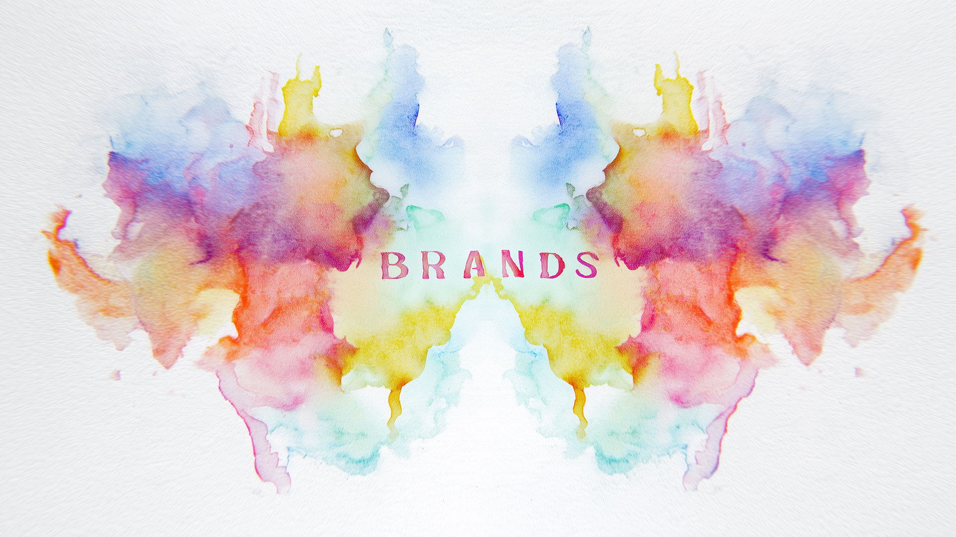
How your logo, colors, and style influence perception and how to design a brand people instinctively connect with.
Think of the last time you came across a new business online. Maybe it was a law firm, a marketing agency, or even a coffee brand. Within seconds, before reading a line of text you’ve made a judgment: Do they seem legit? Professional? For me?
That snap judgment, wasn’t based on their pricing, experience, or even their story.
It was visual. Emotional. Psychological.
That is branding, not just your logo, but the way people feel about you before you say a word.
Branding isn’t just design, it’s psychology. Here are 10 principles that show how visual identity taps into how we instinctively judge, trust, and connect with brands.
If you’re in the process of a rebrand or want to create a stronger connection with your audience, this guide will help you uncover how your brand identity design influences everything from perception to conversion.
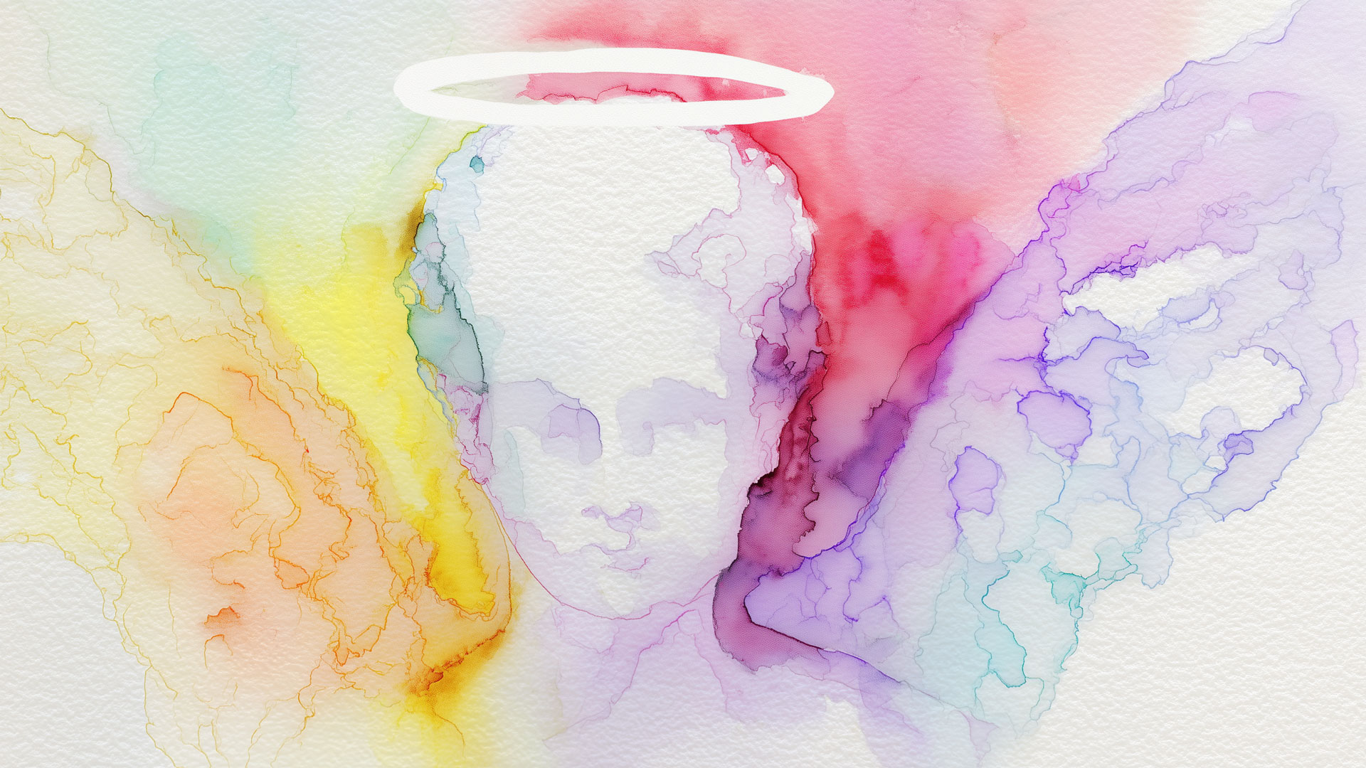
1. The Halo Effect
If one thing looks great, we assume everything else is too.
The Halo Effect explains why people assume a beautifully designed brand must also be high-quality, competent, and trustworthy. It’s the same reason we judge books by their covers, or lawyers by their business cards.
Brand Application
If your logo, colors, and layout feel polished and premium, people will unconsciously extend that quality to your services.
Example
Apple’s minimalist logo and packaging evoke innovation and simplicity — which influences how we perceive their product quality and customer support.
2. The Liking Principle
We trust people (and brands) we like or relate to.
People gravitate toward brands that feel like them or like who they aspire to be. That likability can come from tone of voice, visuals, humor, or shared values.
Brand Application
Build your brand identity around the personality traits your ideal client sees in themselves: bold, nurturing, methodical, rebellious, whatever’s true to them.
Example
Nike’s bold visuals and inspirational messaging resonate with people who see themselves as determined, driven, and ready to push limits, even if they’re just starting out, or even if they don’t work out at all.
3. Authority Bias
We’re more likely to trust those who appear as experts.
From fonts to headshots to badge placements, design can signal authority. When we see certain visual cues–like awards, trust seals, or editorial layouts–we’re more likely to assume legitimacy.
Brand application
Highlight credentials, media features, years in business, or notable clients using visual hierarchy, not just buried text.
Example
The New York Times uses classic serif fonts, clean editorial layouts, and a restrained color palette to signal authority and journalistic integrity. These visual cues reinforce its reputation as a trusted source.
To see how we do this for clients in professional industries, check out our branding for law firms case studies.
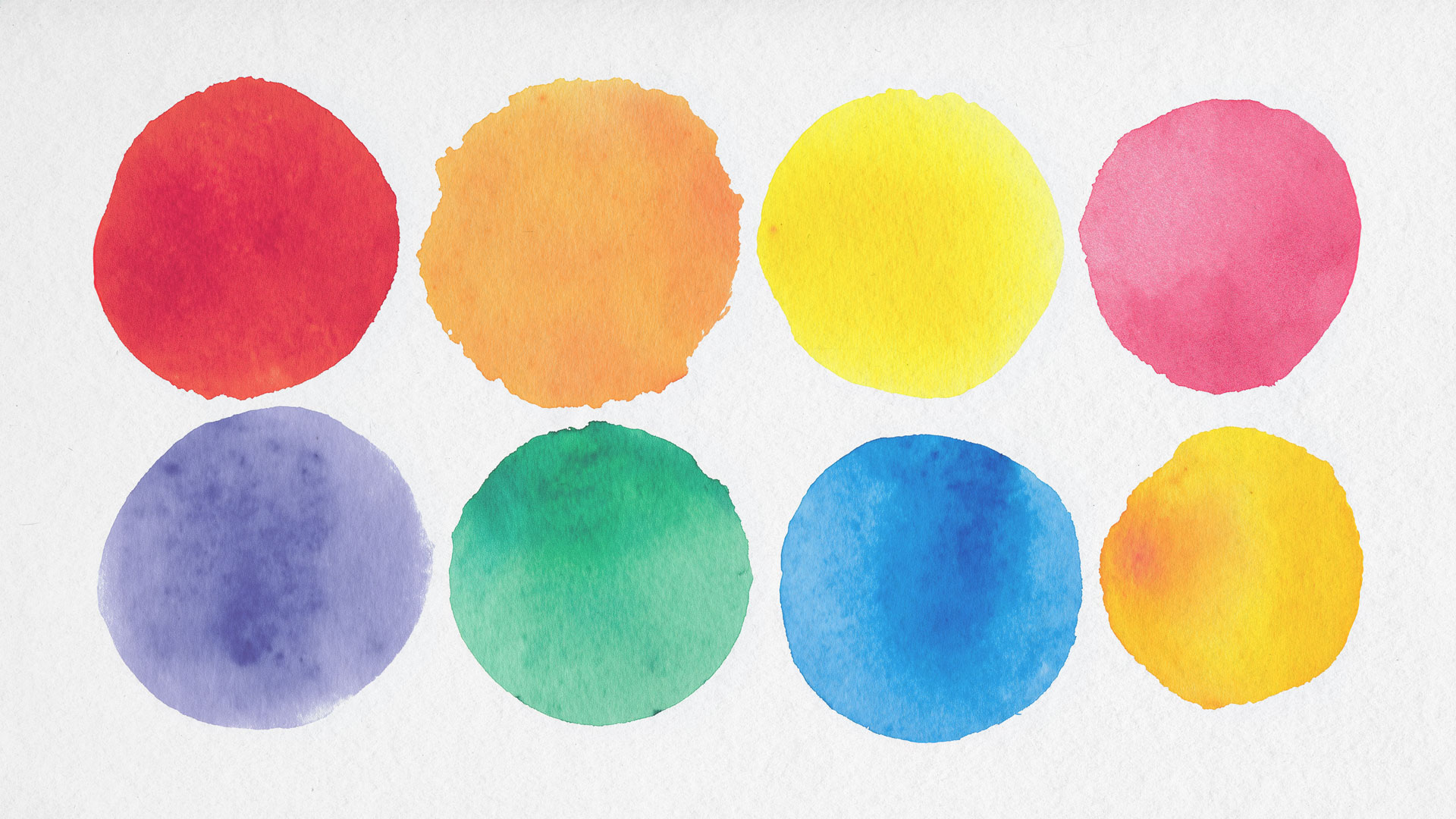
4. Color Psychology
Colors evoke emotional responses — and they’re culturally loaded.
We associate colors with emotions, values, and energy levels. Blue suggests trust and security. Green signals calm and growth. Red grabs attention and urgency.
Brand application
Choose your brand palette strategically based on how you want your audience to feel — and stay consistent across platforms.
Example
PayPal, Facebook, and LinkedIn all use blue to evoke trust and reliability — crucial in finance and professional networking.
Learn more about how we use color strategy in brand identity to enhance emotional connection.
5. Mere Exposure Effect
Familiarity breeds trust.
The more often we see a visual, the more we begin to like and trust it. That’s why brand consistency is so critical, across social media, your website, print materials, and even email signatures.
Brand application
Use consistent typography, color palette, and logo treatment everywhere, repetition builds recognition, and recognition builds trust. Repetition builds recognition, and recognition builds trust.
Example
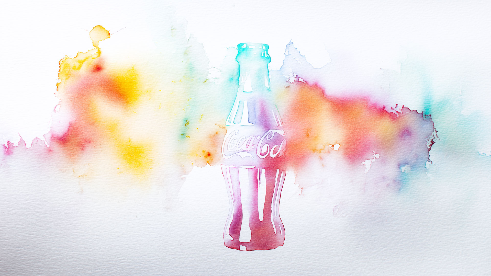
Coca-Cola’s red-and-white color scheme, script logo, and classic bottle silhouette have remained remarkably consistent for over a century. Whether on a billboard, can, or Instagram ad, the brand is instantly recognizable, and that recognition reinforces trust.
6. Anchoring Bias
The first thing people see sets their expectations for everything else.
If your brand “anchor” – your logo, tagline, or homepage headline – feels expensive, modern, or relatable, that will influence how people interpret your pricing, service quality, and even your team.
Brand application
Design your key brand touchpoints to reflect your ideal client’s expectations. They will compare everything else to that first visual impression.
Example
Tiffany & Co., the iconic robin’s egg blue box immediately signals luxury and heritage. Even before seeing the jewelry, the packaging sets the expectation of elegance and high value.

7. Emotional Contagion
Your emotional tone transfers to your audience.
People mirror the tone they perceive – whether that’s calm, joyful, confident, or frantic. Your visual identity should radiate the emotional state you want your audience to feel when they work with you.
Brand application
Use photography, layout rhythm, and tone of voice that intentionally generate the right emotional response.
Example
Patagonia photography of wide-open landscapes, adventurous lifestyle shots, and purpose-driven storytelling creates a sense of clarity, courage, and environmental purpose. That emotional tone is contagious – people don’t just see a brand, they feel part of a movement.
8. Gestalt Principles
Our brains prefer organized, meaningful visuals.
Gestalt psychology shows that we instinctively group elements by proximity, similarity, and alignment. When your design feels structured and intentional, it’s easier to trust.
Brand application
Use spacing, alignment, and repetition to create cohesion in logos and layouts. Avoid clutter or uneven balance that subconsciously creates tension.
Example
Airbnb’s interface uses consistent iconography, soft spacing, and aligned card layouts to make navigation feel natural. The repetition of visual cues like image blocks, star ratings, and buttons – helps users feel oriented and in control throughout their journey.
9. Cognitive Fluency
Things that are easy to process feel more trustworthy.
If your brand name is hard to read, your tagline is dense, or your layout is confusing – people may assume your business is too. Simplicity = credibility.
Brand application
Choose simple typography, plain-English copywriting, and clean design that reads at a glance.
Example
TurboTax takes something complex, taxes, and presents it through a clean interface with easy-to-read fonts, straightforward language, and a guided flow. The cognitive ease reassures users they’re in capable hands.
10. Self-Congruence Theory
We choose brands that reflect who we are… or want to be.
This goes deeper than demographics, it’s about identity. Your brand should be a mirror that reflects your audience’s ambitions, personality, and worldview.
Brand application
Develop a visual identity that aligns with your target audience’s sense of self – whether that’s bold, humble, elite, creative, or community-focused.
Example
Rolex doesn’t just sell watches, it sells legacy, prestige, and achievement. Its visual identity, from refined typography to high-gloss photography, reflects the mindset of people who see themselves as accomplished, discerning, and timeless.
Conclusion
A brand that works isn’t just pretty – it’s psychologically precise.
Every font choice, color, logo stroke, or photography decision sends a message. When those visual elements align with how people instinctively make judgments, your brand becomes more than recognizable; it becomes trusted.
If your brand looks good but doesn’t connect, or if you’re ready to level up how people feel when they see your business — let’s talk.
At Laughton Creatves, we apply human psychology to visual identity so your brand doesn’t just stand out – it resonates.