Smart design starts with understanding how people think. Here’s how to build a website that works with human behavior, not against it.
Your website might be beautifully designed, fast-loading, and responsive. But if it’s not converting visitors into leads or clients, something’s missing. And it’s probably not just your headline or your color scheme — it’s how well your site aligns with human psychology.
We don’t browse websites logically. We scan. We judge quickly. We follow emotional cues. That means the best websites aren’t just user-friendly. They’re brain-friendly.
In this post, we’ll unpack 10 psychological principles that influence online behavior and show you how to apply them to your web design and development for better engagement, clarity, and conversions.
1. Primacy Effect
First impressions matter more than we realize.
People form an opinion of your site in seconds. That means your homepage — especially the first screen they see — needs to immediately say who you are, what you offer, and how to take action.
Web application:
Your layout should be clean, your headline clear, and your CTA obvious. Think less about being clever, more about being immediate.
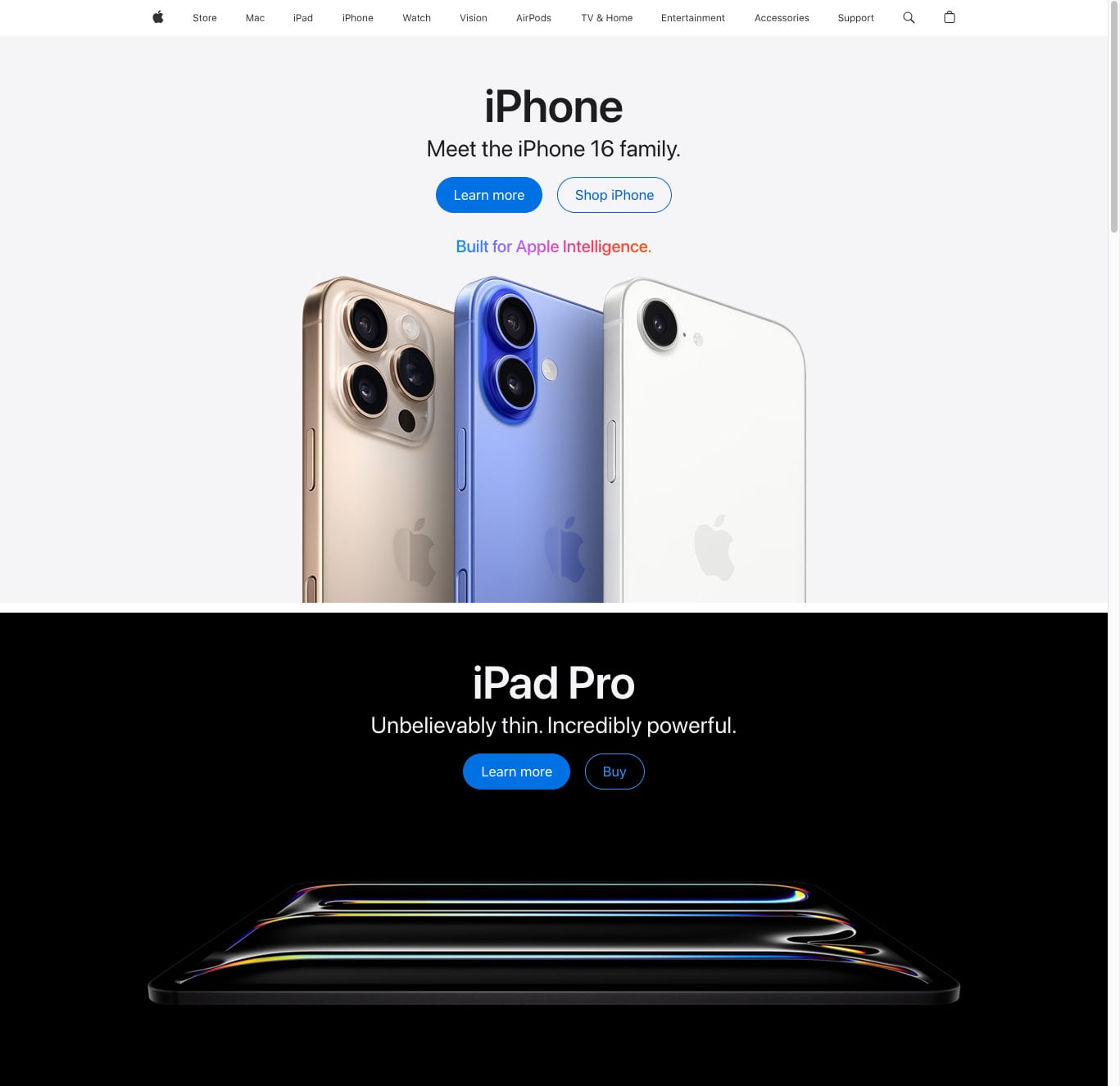
Example:
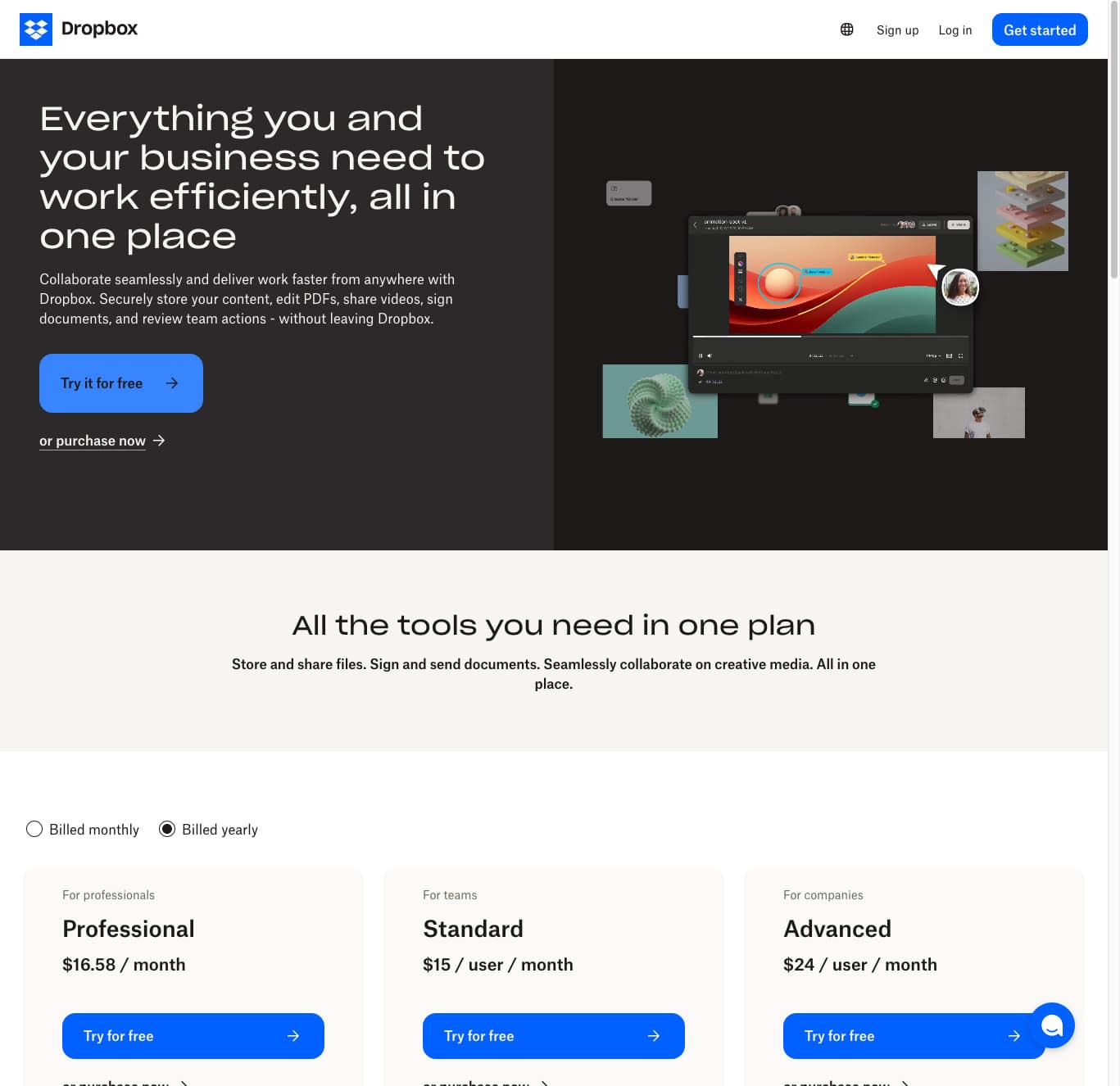
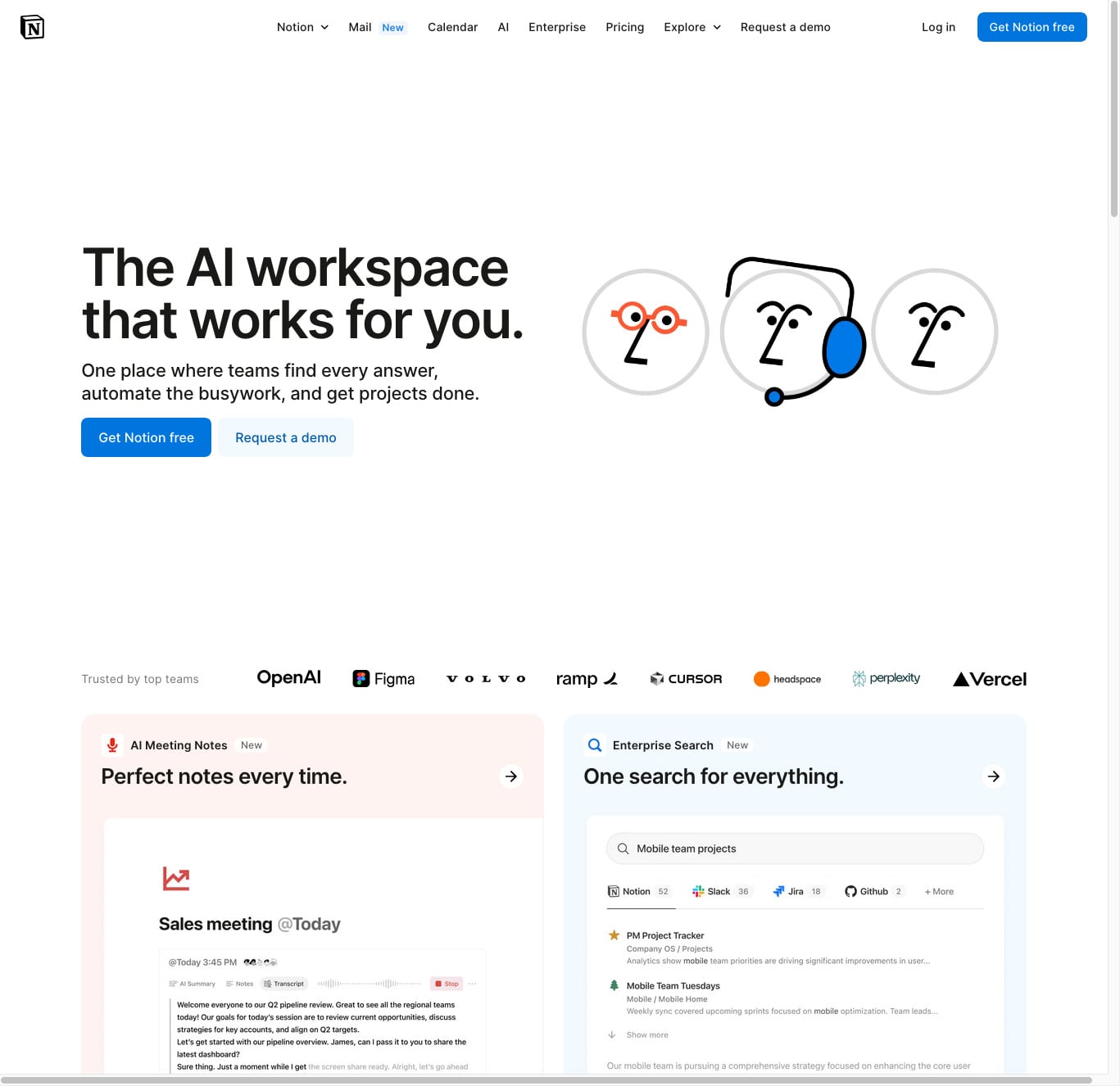
Dropbox’s homepage uses a strong headline, clean layout, and two CTAs — but one is clearly favored. The bold “Try it for free” button stands out, while the secondary “or purchase now” link is more subtle. This isn’t accidental — it guides users toward the action Dropbox wants them to take. Notion takes a similar approach, using prominent CTAs with plenty of breathing room, helping users focus on what to do next.
2. Hick’s Law
The more choices, the slower the decision.
If your navigation has 10 links and your homepage has 6 CTAs, users may get decision fatigue and bounce.
Web application:
Limit top-level menu items to 5 to 7. One CTA per page. Funnel users. Don’t confuse them.
Example:
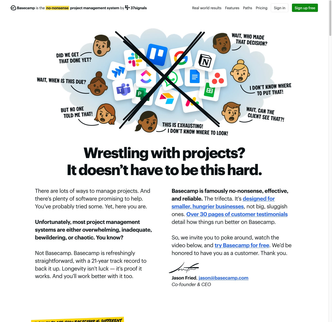
Basecamp has one big red button: “Give Basecamp a Try.” No ambiguity.
3. Cognitive Load Theory
The brain hates clutter.
Complex interfaces, dense copy, and visual noise overwhelm users. If it’s hard to scan, people won’t try.
Web application:
Use visual hierarchy, clean layout, and short blocks of content. Group information and prioritize whitespace.
Also, you’ll notice that premium brands prioritize white space.
Example:
Apple’s product pages guide you with intentional pacing and minimal distractions.
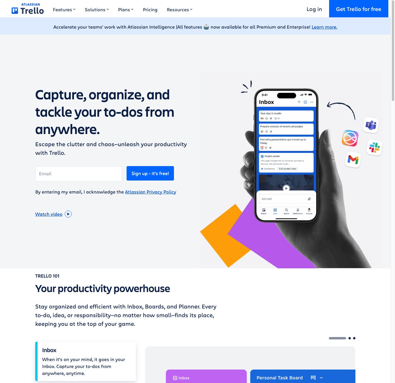
4. Fitts’s Law
Buttons should be easy to find and click.
People are more likely to interact with things that are large, clearly labeled, and predictably placed.
Web application:
Use high-contrast, well-placed CTAs. On mobile, keep them thumb-friendly. Make buttons look like buttons.
Example:
Trello highlights its primary action button — “Sign up — it’s free!” — in a vibrant color with consistent placement across devices. Whether desktop or mobile, the call to action is easy to find and click, reducing friction and guiding users toward engagement.
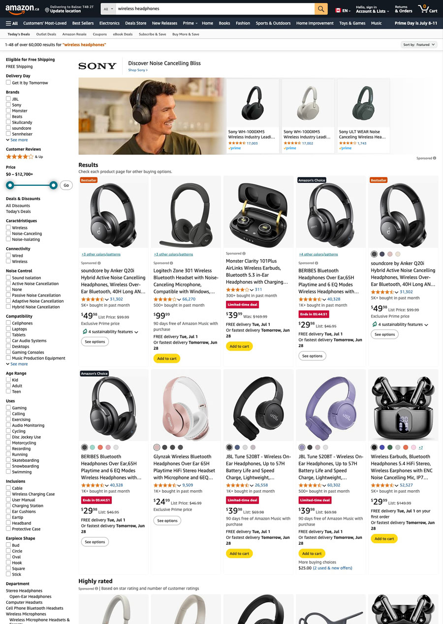
5. The Paradox of Choice
Too many options = no action.
Even if your product or service is complex, your landing pages shouldn’t be. Each page should have one goal.
Web application:
Break your content into guided steps. Use progressive disclosure. Keep CTAs focused.
Example:
When you search for “wireless headphones” on Amazon, the results often display hundreds of options with varying brands, prices, features, and reviews. While filters are available, the sheer number of choices can overwhelm shoppers. Many either delay the purchase, default to the “Amazon’s Choice” recommendation, or abandon the search altogether. This is why many ecommerce brands now simplify with curated collections or guided quizzes — helping users navigate without fatigue.
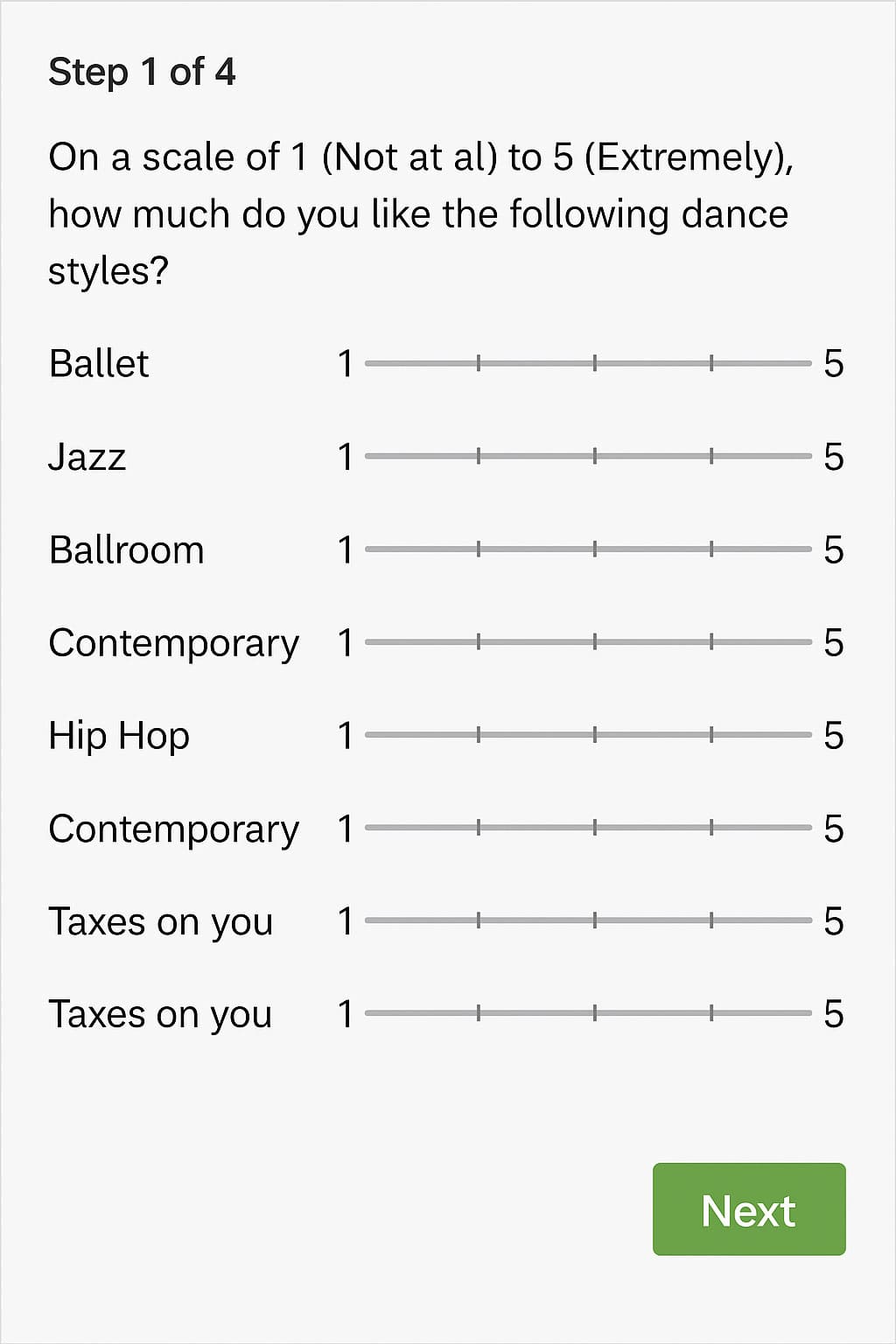
6. Zeigarnik Effect
We’re more likely to complete something once we start.
Progress indicators, step-by-step forms, and onboarding sequences keep users engaged.
Web application:
Instead of long forms, use multi-step formats or show a progress bar. Let people feel like they’re in motion.
Example:
A multi-step form with a progress bar helps reduce overwhelm and encourages completion. Breaking long processes into smaller steps — like name, email, then business details — feels easier to manage and keeps visitors moving forward without friction.
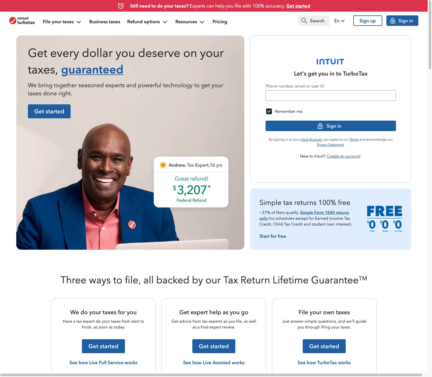
7. Loss Aversion
We’re more motivated to avoid loss than to gain something.
Position your content around what users miss out on if they don’t act, not just what they get if they do.
Web application
Use headlines like “Stop losing leads to confusing websites” or “Don’t let another client bounce.”
Example
TurboTax’s homepage headline is a textbook case of loss aversion:
“Get every dollar you deserve on your taxes, guaranteed.” This isn’t just about getting more; it’s about avoiding the loss of money you’re entitled to. It pushes the idea that if you don’t act, you’re leaving money behind.
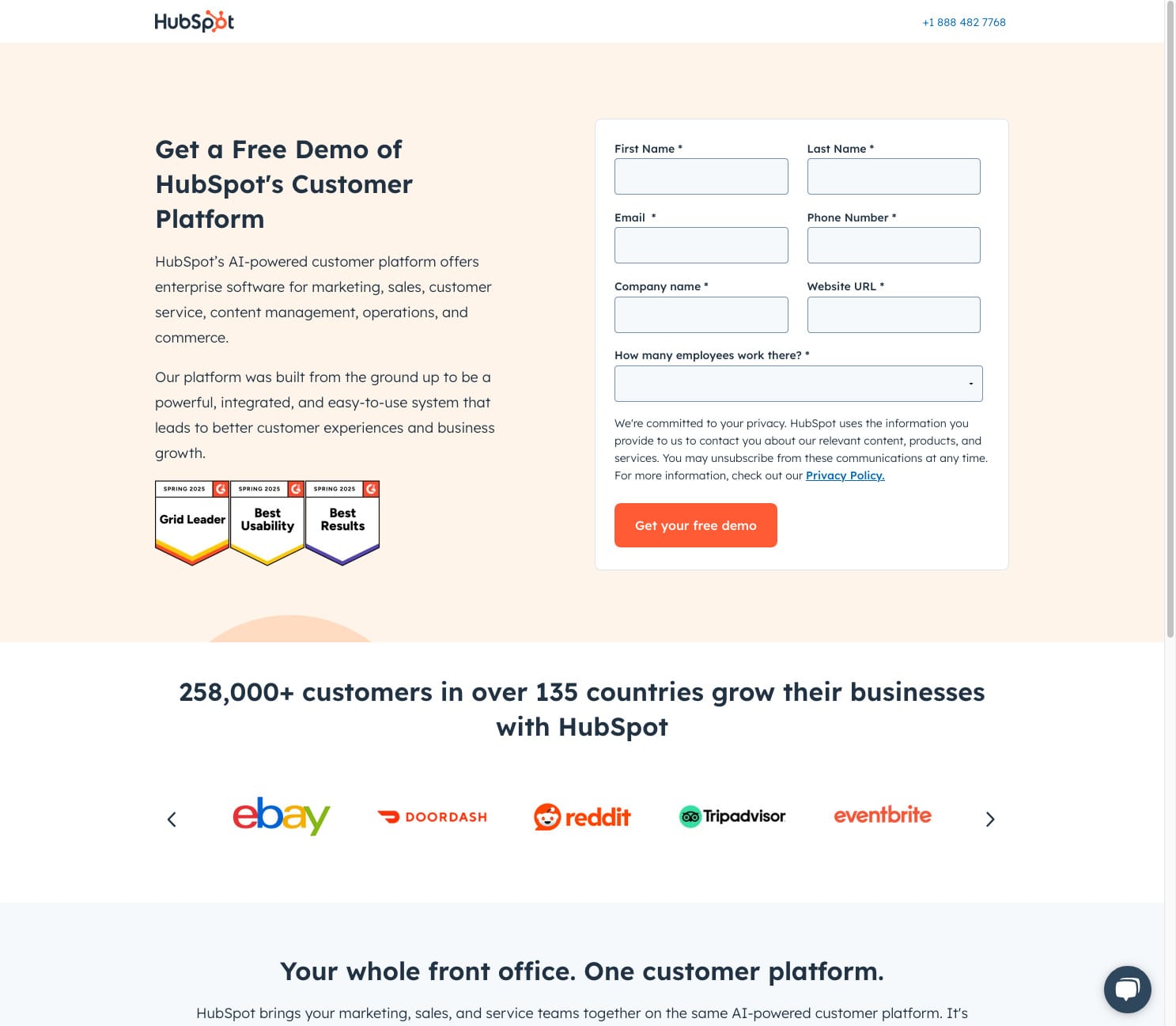
8. Trust Signals
Credibility must be visible.
People subconsciously scan your site for evidence of trustworthiness: client logos, testimonials, secure connections.
Web application
Place testimonials near CTAs. Use HTTPS. Add badges, certifications, and real client names/photos.
Example
HubSpot’s homepage features a banner that says “Trusted by over 184,000 businesses in more than 120 countries.” It’s paired with logos from recognizable companies like Reddit, Discord, and WWF, providing instant social proof of their credibility. See how we incorporate trust-building features into websites we build for professional services.
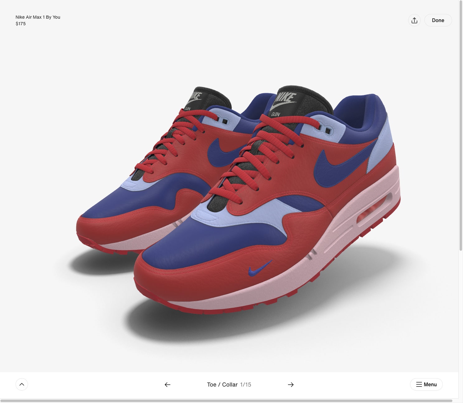
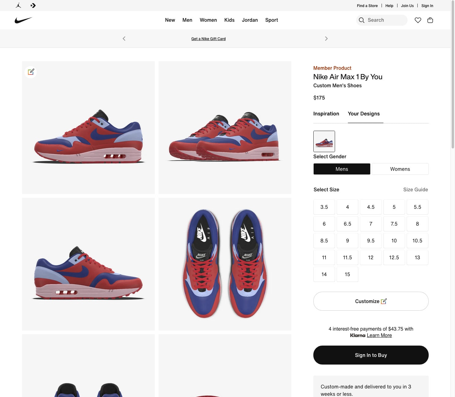
9. Endowment Effect
People value what they feel ownership over.
Interactive features like calculators, pricing estimators, or custom plans make visitors feel personally invested.
Web application
Let users tailor content, generate instant results, or save preferences. This boosts conversion likelihood.
Example
Nike’s “Nike By You” feature allows customers to design shoes by selecting colors, materials, and stitching details. Once someone invests time designing their perfect pair, the feeling of ownership increases — and so does the likelihood of completing the purchase.
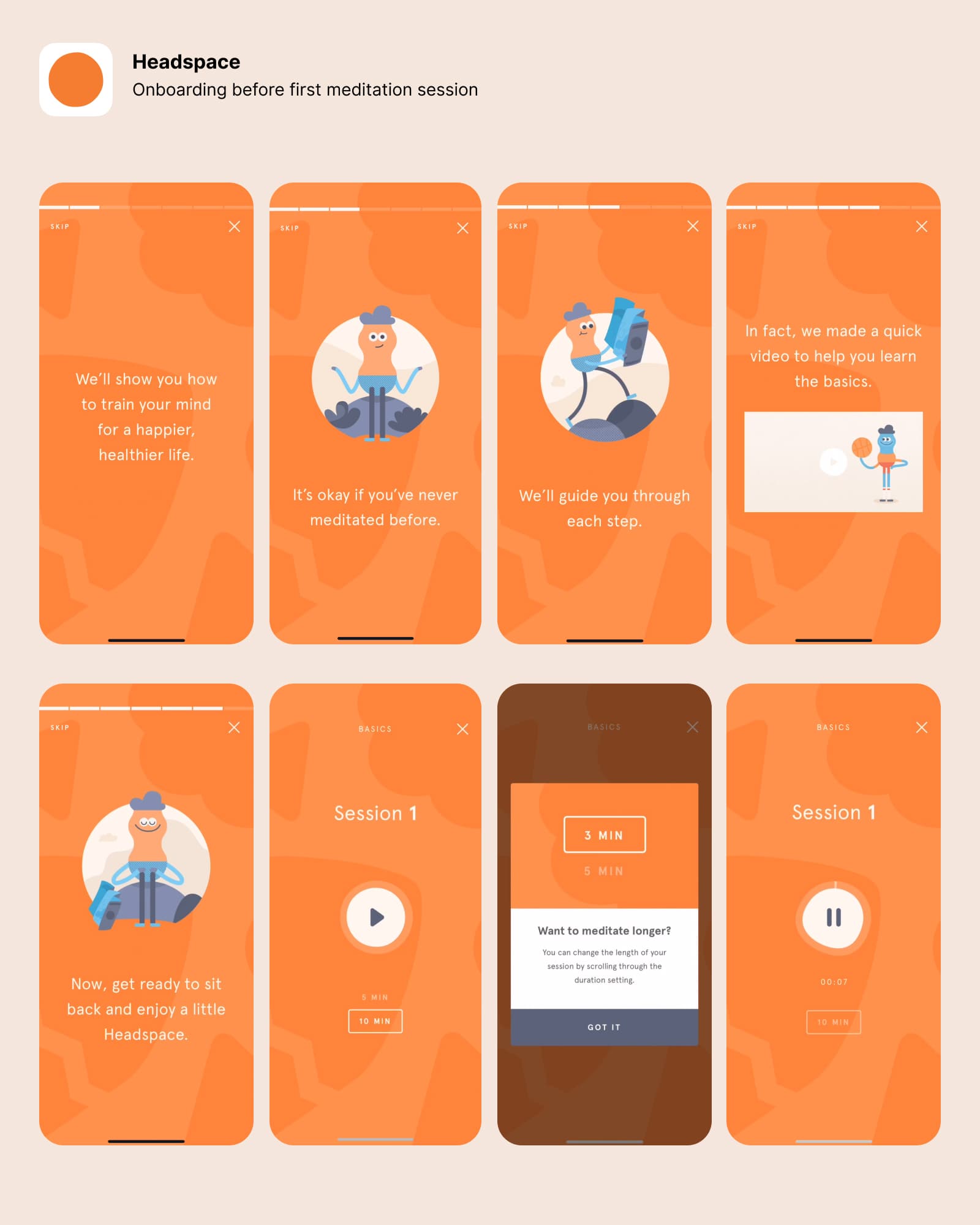
10. Peak-End Rule
We remember the best part and the last part.
Your best messaging should come early. But what happens after someone submits a form matters too.
Web application
Start with friendly, reassuring messages that remove anxiety, like “It’s okay if you’ve never done this before.” Use simple step-by-step guidance combined with playful visuals to make users feel supported. End the flow by offering a small, empowering choice — like selecting the duration of their first session — and a clear, inviting call to action (e.g., “Get ready to sit back and enjoy a little Headspace”). This creates a smooth emotional journey from start to finish, leaving users feeling confident and cared for.
Example:
Headspace’s onboarding sequence is designed to instantly put new users at ease. It starts with warm, friendly messages like “It’s okay if you’ve never meditated before” and “We’ll guide you through each step,” paired with their signature playful illustrations. This creates a gentle, welcoming peak moment that reduces hesitation.
The experience ends by helping users select their first meditation session — offering an empowering choice of session length (3, 5, or 10 minutes) — before hitting play. This closing step creates an end moment that feels achievable, stress-free, and rewarding. Users leave the onboarding flow feeling confident and ready, with positive emotions tied to both the start and finish of their experience.
Conclusion
Your website isn’t just a digital brochure. It’s an interactive experience that shapes how people feel, act, and remember you.
By designing with these psychological principles in mind, you’re not just improving usability—you’re tapping into how people really think. Want to make your site more intuitive, engaging, and conversion-focused? Let’s talk. At Laughton Creatves, we build websites that are designed to work—not just look good.